A first impression that sticks
From bold color to clean structure, this brand was crafted to help a new business show up with confidence, clarity, and plenty of personality.
The Challenge
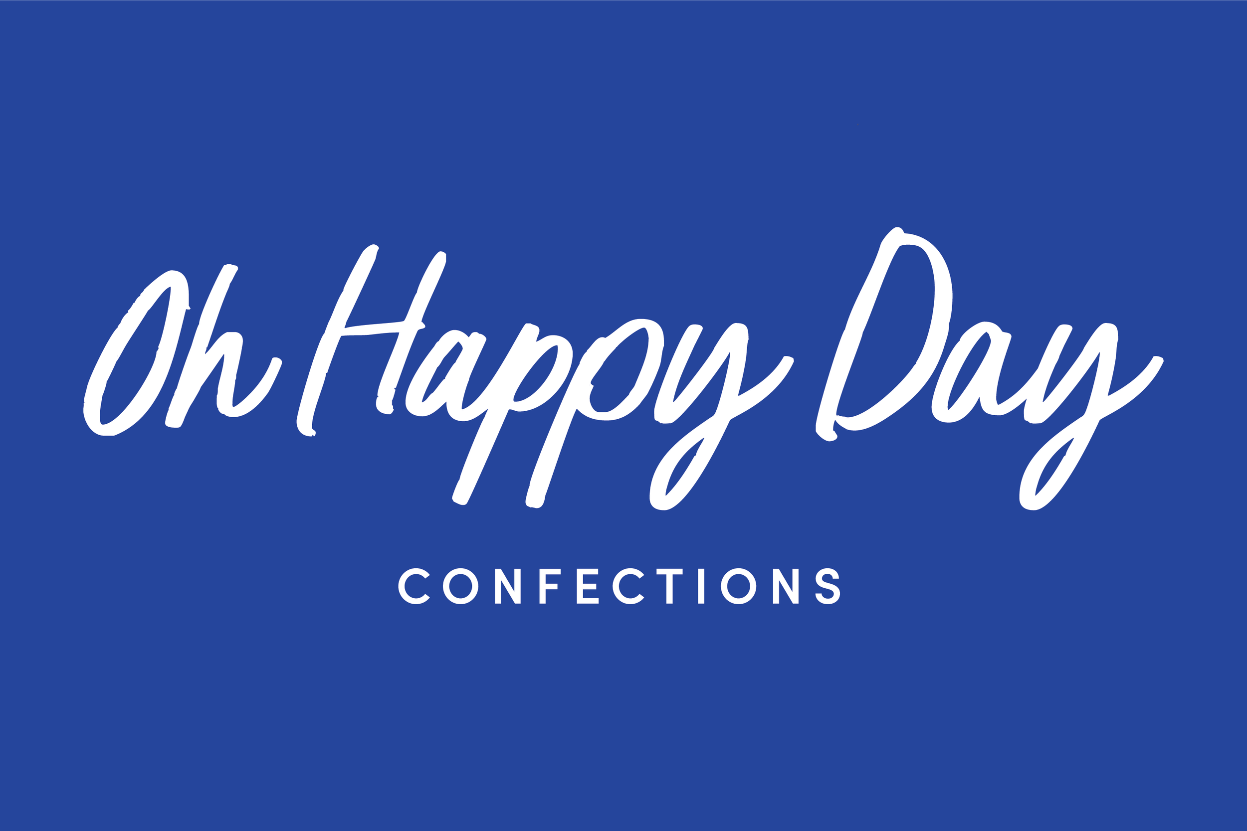
Oh Happy Day Confections was launching with a clear vision—and needed branding to match. The business offers custom treats for celebrations and corporate events, but its DIY look didn’t reflect the level of quality or care behind the products. The goal was to create an identity that felt joyful and vibrant, but still polished enough to be taken seriously by professional clients.
The Approach
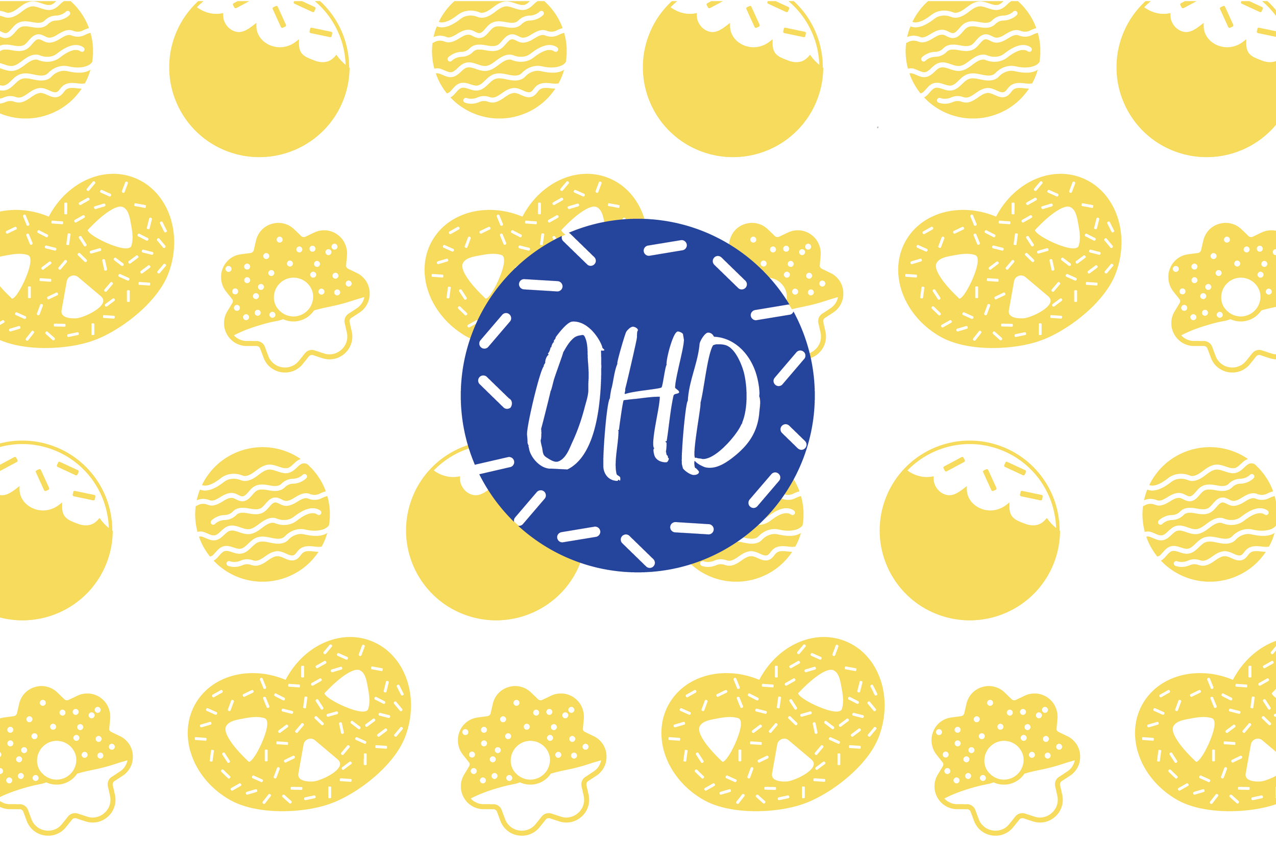
We built a bright, modern identity that balances fun and professionalism. The sunshine yellow and cobalt blue palette feels bold and energetic, while a handwritten logo adds personality without being too playful. Clean typography keeps things feeling polished—but what really brings it to life is the set of custom illustrations. Each one was based on a real treat, helping showcase the product lineup in a way that’s both charming and informative.
The Result
A joyful, polished brand that stands out in the crowded sweets space—and supports the business as it grows. The new identity feels true to the product and vision behind it, helping the brand show up confidently and connect with both celebration-focused and corporate clients alike.
Services Provided