Thoughtfully created, like the gifts it represents
Sophisticated yet personal, this identity reflects the quiet confidence, meaning, and care behind every curated gift.
The Challenge
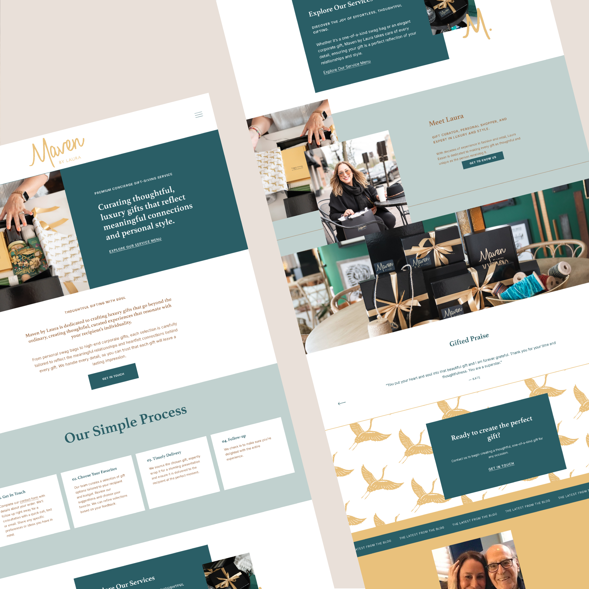
Maven by Laura curates custom gifts that are as meaningful as the moments they celebrate. With every detail intentionally chosen, the experience is heartfelt and high-end. The challenge was to create a visual identity that matched the caliber of the service: polished, joyful, and unmistakably elevated.
The Approach
We designed a brand identity rooted in sophistication and meaning. Teal—fresh, uplifting, and refined—was paired with gold for a feeling of luxury and timelessness. The script logo brings a personal, handwritten quality while still feeling polished and upscale in tone. A clean, minimalist submark adds versatility, and the hand-drawn crane—symbolizing grace, loyalty, and happiness—became the heart of the system. Every element was chosen to reflect the kind of gifting Laura is known for: thoughtful, elevated, and unforgettable.
The Result
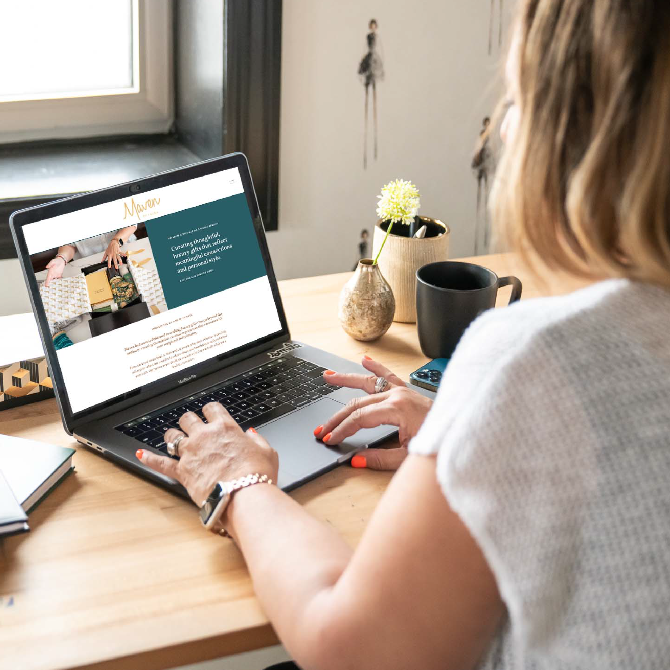
The final identity feels effortlessly elegant. From the color palette to the custom crane mark, every detail aligns with Laura’s mission—to create gifts that truly connect with the people receiving them. Paired with a beautifully designed website and professional brand photography, the visual identity brings Maven by Laura to life in a way that’s refined, joyful, and distinctly memorable.
Services Provided