The logo that whispers—and wins you over
With approachable shapes and subtle symbolism, this identity proves you don’t need to be loud to make an impact.
The Challenge
Cognitive Coaching Solutions blends brain-based coaching with hypnotherapy to guide clients through lasting transformation. The brand needed to show that this isn’t just personal coaching—it’s coaching grounded in neuroscience. The challenge was creating a brand that felt warm and personal while also signaling credibility, logic, and trust.
The Approach
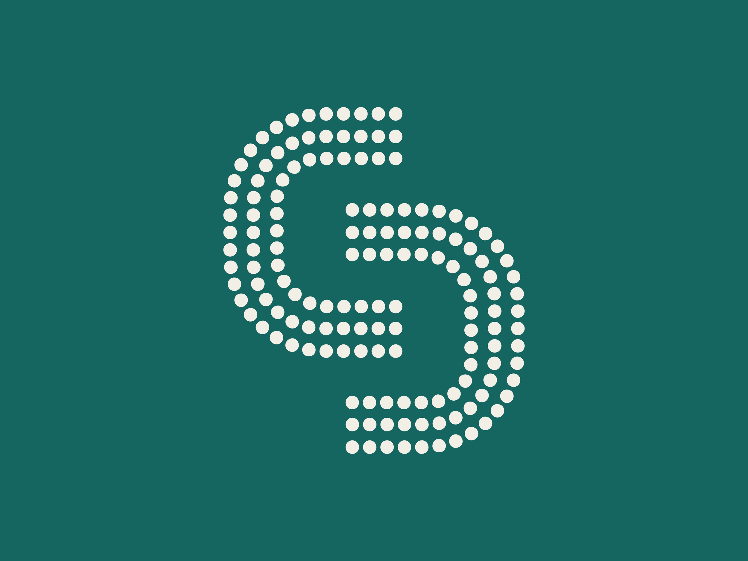
The logo design does the heavy lifting here—quietly powerful, full of meaning, and grounded in structure. The two C’s of “Cognitive Coaching” form a symmetrical shape—one rotated upside down—to convey connection and balance. In the negative space between them, an abstract “S” emerges, representing the flow of Solutions. The letterforms are built from dotted lines, a nod to neural pathways and the science-backed systems at the core of the brand. The color palette and typography reinforce a sense of calm confidence—inviting clients in, then guiding them forward with clarity.
The Result
This identity is both simple and layered—just like the work it represents. It signals calm, structure, and transformation all at once, giving Cognitive Coaching Solutions a look that’s deeply aligned with its mission. The design doesn’t just reflect what the business is today—it’s built to grow alongside it.
Services Provided