Designing Your Brand: Setting the Mood with Mood Boards
Hey there! Welcome back to our brand identity design journey. Last time, we took a deep dive into how crucial a solid brand identity is – a bit like putting together a puzzle that speaks to your audience on a personal level. Today, and in the coming articles, I'm excited to walk you through how to turn your brand strategy into a visual representation that captures your business's essence.
From Words to Images: Building a Brand Mood Board
After you've defined your brand's essence and mapped out your brand strategy, as we covered in "Building a Strong Foundation: How to Define Your Brand’s Essence and Stand Out," the creation of a mood board takes center stage. Seriously though, it's not just a step. It's like the launching pad for the whole creative journey!
So, what's a mood board? It's like a translator. It takes all those ideas and words you've crafted in your brand strategy and turns them into a visual representation. Imagine it's a bridge that connects the dots between plain words and relevant imagery, adding personality and depth to your brand. Your mood board is a mix of images, colors, patterns, textures, and fonts – all chosen carefully to match your brand's core vibe. This board basically becomes a tangible embodiment of your brand's unique voice.
But it's not just about visuals. When you look at your mood board, it should stir up the same feelings you're aiming for with your brand identity. Remember those 3 or 4 keywords that define your brand's character? Yep, they come into play here. The mood board takes these keywords and transforms them into images that light up the path for your creative decisions throughout the entire brand design process.
Fast forward a bit – you're almost at the finish line of this creative journey. Picture this: your brand identity toolkit. It's got everything you need – logos, colors, fonts, graphics. Now, here's the magic part. These toolkit elements resonate with the same vibes and emotions you soaked up from your mood board. It's not a coincidence; it's a well-crafted process that ensures your visual identity carries the very essence you want to share.
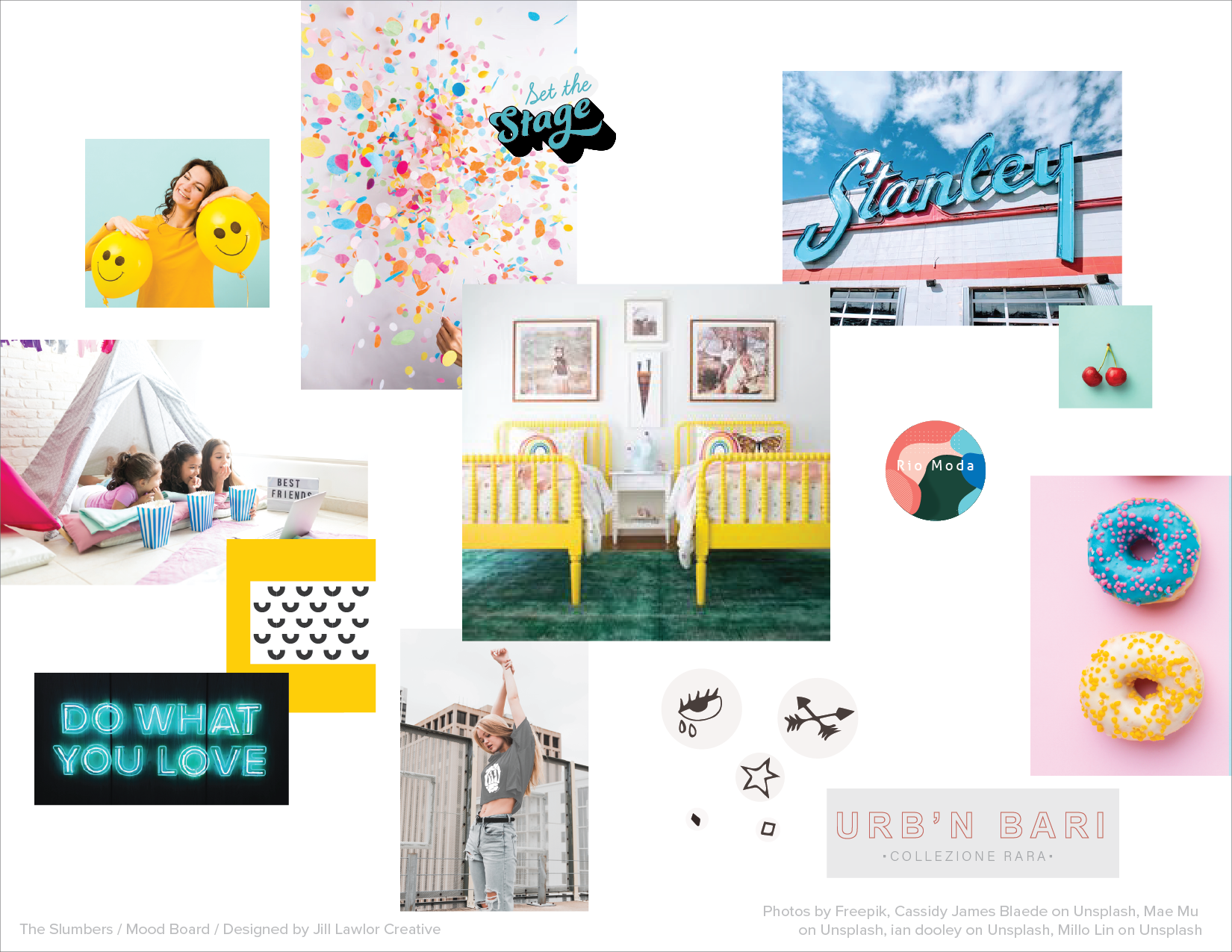
By way of example, I had the privilege to craft the brand identity for The Slumbers, a luxury slumber party planning service. In the brand strategy phase, we pinpointed the keywords: chic, trendy, fun, and youthful. Armed with these words, I embarked on a quest across the digital realm, gathering images that personified these concepts. Here is the mood board – think about what these images make you feel.
Take a peek at the mood board and really soak in the vibes these images are dishing out. As you gaze upon it, you'll notice an irresistible blend of chic, trendy, fun, and youthful elements – all snuggled up together in harmony. The colors, well, they're like splashes of joy and sunshine, giving off an unmistakable sense of fun, happiness, and youthful energy. And hey, don't miss those neutrals. They bring in a touch of class and modern flair – kind of like that effortlessly stylish friend we all have.
Now, let's talk fonts. Notice the neon-inspired script type, like those cool signs you spot on a bustling street. It's trendy, sure, but it's also like a wink that says "Hey, we craft things with care, just like we do for each of our awesome parties." But it's not alone in this font game. Oh no, it's got a partner – clean, minimal type that's all about balance. It's the yin to the neon's yang, bringing that chic factor into the mix.
So, what's the grand takeaway? This mood board isn't just an artsy collage. It's a feeling. The vibes here, they're vibrant, dynamic, and full of life – just like the buzz of a lively gathering. And that's what we're aiming for – a brand identity that's not just seen, but felt. A brand that makes you want to dive right in and be part of the festivities.
At this stage in the brand identity process, we're not crafting final logos or graphics. We're exploring colors, fonts, and visuals that channel those keywords and feelings you're aiming for. Do the colors and images come together to tell the story you're aiming for? Do they stir up the emotions you want to convey?
As this chapter ends, know that this step is setting the stage for the next phase – where your designer's creativity meets your vision. Hang tight for the next piece where we'll dive deeper into the nitty-gritty of designing your brand identity. Stay tuned!


